A brochure can have strong design, accurate color, and clear copy, then lose impact the moment it feels thin, scuffs easily, or folds awkwardly. That final stage matters more than many buyers expect. This guide to commercial print finishing options explains how coatings, cuts, folds, binding, and other finishing choices affect the way your printed materials look, feel, and perform in the real world.
For businesses and organizations, finishing is not simply decoration. The right choice can protect a frequently handled menu, make a presentation folder feel more substantial, help a direct-mail piece get noticed, or keep a multi-page booklet organized. The best option depends on the purpose of the piece, the stock, the quantity, the budget, and how people will use it.
Why print finishing deserves early planning
Finishing happens after ink is applied, but it should be considered before a file goes to press. A fold affects panel size and artwork placement. A coating can change the appearance of color and the feel of writing on a surface. A binding method influences page count, margins, and how well a booklet lies flat.
Planning early also prevents practical problems. Fine type, QR codes, and important logos should not sit on a fold line. A design intended for foil or embossing needs appropriate space and contrast. If a piece will be mailed, displayed outdoors, handled by staff, or stored in a vehicle, durability may matter more than a premium visual effect.
A local print partner can help match the finish to the job instead of treating every project the same. That guidance is especially valuable when a business is ordering a new product for the first time or coordinating several branded pieces for an event.
Commercial print finishing options that change the result
Coatings: protection and visual character
Coatings are among the most common finishing choices because they improve appearance and protect the printed surface. Gloss coating creates a smooth, reflective finish that can make photographs and bold colors appear more vivid. It is a popular choice for promotional flyers, product sheets, postcards, and image-heavy brochures.
Matte coating provides a softer, non-reflective appearance. It often feels more refined and makes text easier to read under bright lighting. Matte works well for premium brochures, corporate materials, menus, and designs with dark backgrounds. The trade-off is that matte surfaces can show fingerprints more readily, particularly on solid dark colors.
Silk or satin finishes sit between gloss and matte. They reduce glare while retaining some color richness and a smooth feel. This can be a practical middle ground for business cards, presentation materials, and brochures that need a polished but understated appearance.
Lamination adds a thin protective film rather than only a coating. It is a strong choice for items that receive repeated handling, such as menus, reference cards, training sheets, maps, and durable promotional pieces. Lamination can be glossy, matte, or soft-touch. Soft-touch lamination has a velvety feel that can make a business card or cover stand out, though it is usually best reserved for projects where that added tactile value supports the budget.
Folding: turning flat sheets into useful formats
Folding determines how information is revealed and how easily a piece fits into a pocket, envelope, rack, or display. A standard half-fold is straightforward and effective for programs, newsletters, and simple brochures. A tri-fold creates six panels and remains a dependable format for service overviews, menus, and take-away information.
More involved fold patterns can add structure when the content calls for it. Gate folds open from the center, making them useful for a dramatic image or message inside. Z-folds create a zigzag sequence that works well for step-by-step information, maps, or schedules. Accordion folds can hold more panels while remaining compact.
Paper weight matters here. Heavy cover stock may need scoring before folding to prevent cracking along the fold, especially with dark ink coverage. Scoring creates a controlled crease and produces a cleaner, more professional result. It is a small production detail that protects the look of the finished piece.
Cutting, trimming, and shape
Standard trimming creates clean, consistent edges and is part of nearly every commercial print order. Beyond that, specialty cutting can change the character and usefulness of a piece. Rounded corners soften the look of business cards, rack cards, loyalty cards, and tags while reducing worn corners over time.
Die cutting uses a custom shape to cut paper or other print materials into a specific form. It can create shaped hang tags, custom folders, product cards, window cutouts, and memorable direct-mail pieces. Die cutting is most worthwhile when the shape supports the message or function. A custom silhouette can be effective, but it should not make the piece difficult to mail, display, or store.
Perforation is another functional option. It creates a clean tear-off section for coupons, tickets, reply cards, sign-up forms, or invoice remittance slips. For operational forms and event materials, a well-placed perforation often adds more value than a more decorative finish.
Binding: keeping multi-page materials together
Binding is central to booklets, catalogs, manuals, programs, reports, and training materials. Saddle stitching uses staples along the folded spine. It is economical, clean, and well suited to smaller page-count booklets, provided the total number of pages works with the format.
Perfect binding uses glue along a flat spine and gives books, thicker catalogs, and annual reports a more polished appearance. It provides room for a printed spine, which improves shelf visibility. Perfect binding requires enough pages and a suitable paper choice to create a durable spine.
Coil binding uses a plastic or metal coil through punched holes. It allows pages to turn fully and lie flat, making it ideal for manuals, workbooks, price books, recipe collections, and training documents. Wire binding offers similar function with a more formal appearance. The right decision often comes down to page count, expected handling, and whether the document needs to remain open on a desk.
Specialty finishes for high-impact pieces
Specialty finishing should have a purpose. It can direct attention to a logo, reinforce a premium position, or add a memorable tactile element to a piece someone might otherwise set aside.
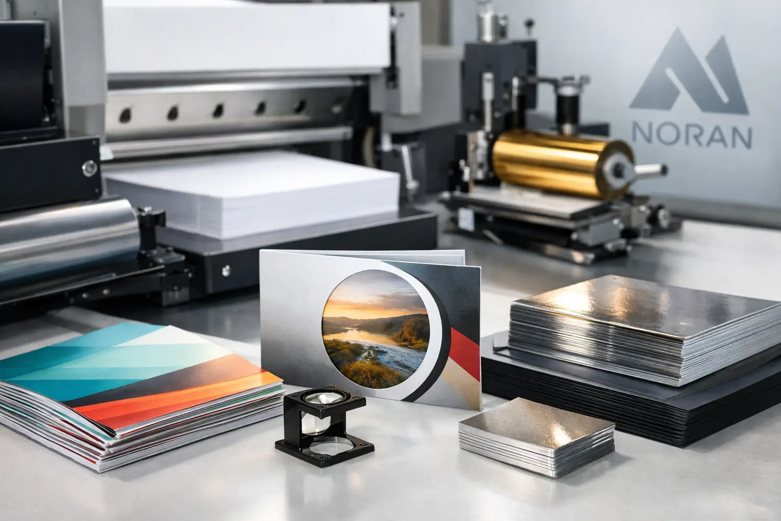
Foil stamping applies a metallic or colored foil to selected areas. Gold, silver, and other foils can make a logo, title, or invitation detail stand out. Embossing raises an area of the sheet, while debossing presses it inward. Either can add dimension without adding more ink. These techniques are particularly effective on premium business cards, certificates, folders, event invitations, and branded packaging components.
Spot UV applies a high-gloss coating to chosen areas rather than the full sheet. It is often used over a logo, photograph, or pattern on a matte background, creating contrast people can see and feel. Because its effect relies on contrast, spot UV needs careful artwork preparation and may not suit every design or paper stock.
Painted edges, colored stocks, and white ink printing can also create distinction, especially for premium cards and short-run branded materials. These options tend to work best when the design is simple and deliberate. Adding several effects to one piece can become distracting and increase costs without improving communication.
How to choose the right finish for the job
Start with the job’s working conditions. A restaurant menu, for example, benefits from a finish that resists frequent handling and can be wiped clean. A real estate brochure may benefit from a rich gloss or silk finish that supports photography. An employee handbook may need coil binding so it remains open during training.
Then consider the message. A luxury service brand may choose thick stock, matte lamination, and restrained foil. A community event flyer may need a cost-conscious gloss stock that makes the date, sponsor logos, and graphics easy to notice. An invoice form needs reliable paper, perforation where needed, and clear usability – not an expensive specialty treatment.
Before approving a finish, review these practical questions:
- Will people write on it, handle it often, mail it, or display it outdoors?
- Does the finish support the brand’s personality and the purpose of the piece?
- Are folds, binding, and margins accounted for in the artwork?
- Is the added production cost likely to improve response, durability, or usability?
A printed sample can be valuable when color, texture, or durability is central to the decision. What looks right on a screen may feel very different in hand.
Get the details right before production
Commercial print finishing works best when design, paper, presswork, and final assembly are coordinated from the beginning. Provide the intended size, quantity, use case, and deadline alongside the artwork. If you have an existing piece you want to match, bring it in. If you are uncertain about stock or finishing, ask before the file is finalized.
For businesses in Kamloops and surrounding communities, Noran Printing can help turn those choices into printed materials that are consistent, practical, and ready to represent your organization well. A thoughtful finish does not need to be elaborate – it simply needs to make the piece more useful, more durable, or more memorable once it reaches the people it was made for.