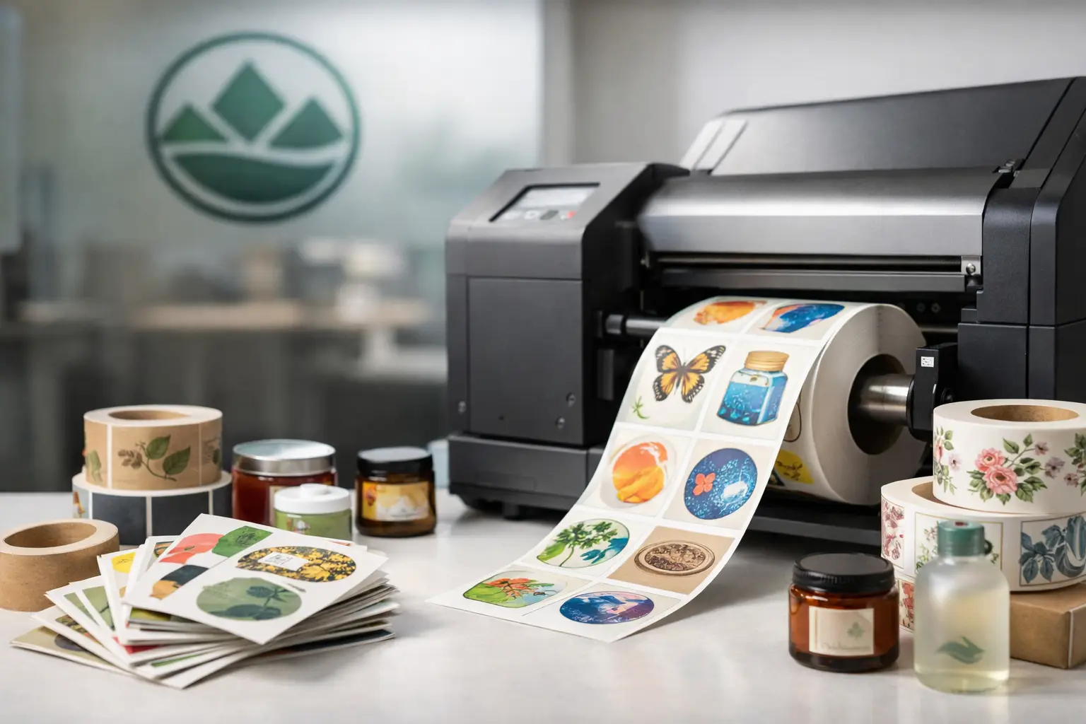
A label can do far more than identify a product. It can carry handling instructions on a warehouse box, give a jar a professional shelf presence, keep office files organized, or make an event package feel considered and complete. When the stock, adhesive, size, and finish are right, labels work hard without drawing attention to the work behind them. When they are wrong, they peel, smudge, wrinkle, or create confusion at the point of use.
This guide to custom label printing is designed for businesses and organizations that need labels to look professional and perform reliably. Whether you are ordering product labels, shipping labels, inventory stickers, branded seals, or variable-data labels, a few practical decisions at the beginning will protect your budget and your brand.
Start With the Job the Label Must Do
Before selecting a shape or designing the artwork, define where the label will be used and what it needs to withstand. A label applied to a dry indoor carton has very different requirements from one applied to a cold beverage container, an oil bottle, or equipment stored outdoors.
Consider the surface first. Smooth glass, coated packaging, cardboard, plastic containers, painted metal, and rough paper all accept adhesives differently. Curved containers add another consideration: a large, stiff label may lift at the edges even when the adhesive itself is suitable. If a label will be refrigerated, exposed to moisture, handled frequently, or stored in a dusty environment, say so before production begins.
The information on the label matters just as much. A simple logo seal has room for visual impact. A product label may need ingredients, directions, a barcode, batch information, warnings, and contact details. Operational labels often prioritize legibility over decoration. The best choice depends on the job, not on a single “best” material for every application.
Choose a Label Material That Fits the Environment
Paper labels are a practical, cost-effective choice for many indoor uses. They are well suited to boxes, folders, retail packaging, envelopes, promotional items, and products that will stay dry. Paper also gives designers useful options, from clean white stocks to textured or uncoated finishes that support a more handcrafted appearance.
For labels exposed to water, refrigeration, oils, frequent handling, or outdoor conditions, synthetic materials are often the better investment. These materials resist tearing and moisture far better than standard paper. They can cost more upfront, but replacing failed labels, relabeling products, or dealing with a damaged presentation costs more than choosing the proper stock from the start.
Finish affects both appearance and performance. A gloss finish makes color appear more vivid and can be easy to wipe clean. Matte finishes reduce glare and offer a refined, understated look that works well for premium goods or labels with detailed text. Uncoated stocks can be useful when labels need to be written on, stamped, or marked by hand.
If your label will be used in demanding conditions, testing is worth the time. Apply a sample to the actual container or surface, then expose it to the same cold, handling, moisture, or storage conditions it will face in the field. A small test can prevent a large production problem.
Adhesive Is Not an Afterthought
The adhesive is the working part of the label. Permanent adhesive is appropriate when the label should remain in place for the life of the product or package. Removable adhesive is useful for temporary pricing, event materials, returnable containers, and labels that must come off cleanly. Freezer-grade or specialty adhesives may be needed when labels are applied or stored at low temperatures.
Be clear about when the label will be applied. Some adhesives perform well on a room-temperature container but struggle when applied to a cold surface. Others need time to bond fully. Sharing those details with your print provider leads to a recommendation based on real use, not guesswork.
Design Labels for Fast, Accurate Reading
Labels often have very little space, which makes hierarchy essential. Decide what someone needs to notice first: the product name, a safety instruction, a department, a date, or a barcode. Give that information the strongest position, largest type, and clearest contrast.
Avoid treating a label like a miniature brochure. Crowding every available space with text may technically fit the information, but it does not make it easy to use. Leave enough open space around key details, especially on small labels. A clean layout communicates confidence and helps reduce errors in busy workplaces, retail settings, and shipping areas.
Color should support the label’s purpose. Brand colors create recognition, while high-contrast combinations improve readability. Dark type on a light background is generally the safest choice for directions, ingredients, item numbers, and barcodes. If color is used to distinguish product variations or departments, make sure the label still works when viewed quickly or printed in a smaller format.
Barcodes and QR codes need proper sizing and clear space around them. Do not place them over busy backgrounds, too close to an edge, or on a tight curve where scanning may be inconsistent. A print proof is useful, but a physical scan test is even better when codes are central to your process.
Pick a Size and Shape That Works on the Actual Surface
A label can look balanced on a screen and still feel awkward once it is applied. Measure the usable labeling area on the product, package, folder, bin, or container. Account for seams, ridges, handles, corners, and curved sections that could interfere with application.
Standard rectangles, squares, circles, and ovals are efficient choices for many jobs. They are familiar, practical, and easy to apply. Custom die-cut shapes can create a distinctive presentation, particularly for retail packaging, promotional labels, and branded seals. The trade-off is that custom shapes may involve additional setup and are not always necessary for operational labels.
Think about application, too. A small label may save material but slow staff down if it is hard to peel and place. A larger label can improve visibility and application speed, but it must fit the surface without buckling. For recurring orders, a size that works smoothly in day-to-day operations is usually more valuable than a design that only looks impressive in a mockup.
Plan Quantities Around Use, Storage, and Change
Ordering a larger quantity often reduces the unit cost, but the lowest per-label price is not always the best value. Product information changes. A phone number, ingredient statement, pricing message, address, logo, or regulatory requirement may need an update sooner than expected. Ordering years of inventory can leave you with labels that cannot be used.
Estimate how many labels you use in a normal month, then consider seasonal demand, new product launches, and expected changes. A stable shipping label or internal asset label may justify a longer run. A campaign sticker, limited-time menu label, or label with variable pricing is usually better ordered in shorter quantities.
Variable data printing is especially helpful when labels require unique names, serial numbers, mailing details, barcodes, batch codes, or sequential numbering. Instead of manually writing information after printing, each label can be produced with the correct data already in place. That reduces repetitive work and helps maintain consistency across larger jobs.
Prepare Files That Print Cleanly
Professional label printing begins with clear source files. Supply logos as high-resolution files whenever possible, and use the correct version of your brand colors. Images pulled from websites or screenshots are often too low in resolution for sharp print, especially on small labels where any softness is easy to see.
Keep important text and logos away from the trim edge. Labels are cut after printing, and a small safety margin gives the finished piece a clean, intentional appearance. If your design includes a background color or image that reaches the edge, it should extend beyond the cut line to prevent an unintended white border.
Proofreading is not a formality. Check spelling, phone numbers, web addresses, product codes, quantities, legal language, and version dates before approval. For labels used across multiple locations or departments, have someone familiar with the daily process review the proof as well. They may catch a missing instruction or a confusing sequence that is not obvious from the design alone.
Work With a Print Partner Before the Deadline
Labels are often needed quickly because they sit at the end of a production, packaging, or event timeline. The most dependable way to protect your schedule is to involve your printer early, particularly when you need a specialty material, a custom shape, variable data, or labels for difficult conditions.
A local print partner can help narrow the options, check files, produce a proof, and coordinate related materials such as brochures, menus, packaging inserts, promotional products, or signage. For businesses and organizations in Kamloops and the surrounding region, Noran Printing provides the practical guidance and production capability needed to keep branded materials consistent under one roof.
The right custom label is not simply attractive. It stays attached, remains readable, supports your staff, and represents your business well every time someone picks up the product or package.