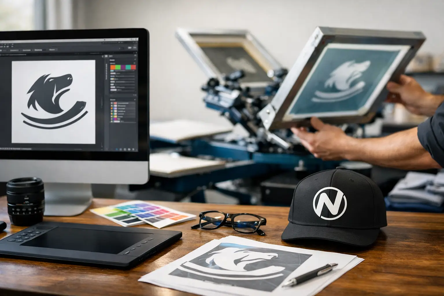
A screen-printed shirt can look excellent in a mockup and still run into trouble on press. A thin line may fill in, a gradient may reproduce poorly, or a logo that looked black on screen may require an unexpected ink setup. Knowing how to prepare files for screen printing helps prevent those issues before production begins, protecting your timeline, budget, and finished product.
Screen printing is a production process, not simply a matter of placing artwork on apparel. Each ink color, detail level, fabric choice, and print location affects how the art needs to be built. A production-ready file gives your printer clear information and leaves less room for costly assumptions.
Start With the Intended Product and Print Location
Prepare artwork for the item being printed, not just for a digital presentation. A left-chest logo, full-front event graphic, sleeve print, and back-of-shirt design all have different practical size ranges. Ask for the preferred print dimensions before finalizing the art, particularly when ordering youth sizes, tote bags, uniforms, or garments with seams, zippers, pockets, and unusual panel shapes.
A design that is 12 inches wide may work well across the front of an adult T-shirt but overpower a small hoodie or become impractical on a narrow tote. If a single design must work on several garment sizes, it may need a carefully chosen standard size or separate versions. The goal is a balanced, readable print on the actual product.
Fabric also matters. Fine detail that prints clearly on a smooth, light cotton shirt can behave differently on fleece, textured blends, dark garments, or performance fabrics. Share the garment type and color early so the print approach can be planned around it.
Build Screen Printing Artwork as Vector When Possible
For logos, lettering, icons, and simple illustrations, vector artwork is the preferred starting point. Vector files are made from mathematical paths rather than pixels, so they can be scaled without becoming blurry. Common vector formats include AI, EPS, PDF, and SVG, although a print-ready PDF is often the most practical file to supply.
Raster images, such as JPG, PNG, PSD, and TIFF files, can also be used when they are high resolution and prepared at final print size. For a standard full-color or detailed raster image, provide artwork at 300 pixels per inch at the size it will print. Enlarging a small web image does not create missing detail. It only makes the existing pixels larger.
Avoid sending screenshots, images copied from social media, or logos pulled from a website whenever possible. They are usually low resolution and may have compression artifacts, soft edges, or incorrect colors. If the only available asset is a small raster file, a printer may be able to redraw it, but that should be identified before the job moves into production.
Keep Type, Lines, and Small Details Printable
Very thin lines, tiny text, and tightly packed details are common causes of disappointing prints. What appears crisp at 400% magnification on a monitor may not hold on fabric once ink, mesh, garment texture, and curing are involved.
Convert fonts to outlines in final vector artwork, or provide the font files if editing may still be needed. Outlining prevents substitution issues when the file is opened on another system. Before converting, keep an editable version for future changes.
As a general rule, simplify artwork that relies on hairline strokes, miniature copy, or narrow gaps between shapes. The exact minimum line weight depends on the design, ink, mesh, and garment, so there is no one-size-fits-all number. A production team can advise whether a detail should be thickened, opened up, or removed.
Define Every Ink Color Clearly
Screen printing uses separate screens for separate ink colors. That makes color planning one of the most important parts of file preparation. Do not rely on a visual appearance alone to communicate color intent.
For designs with solid inks, build each intended print color as a distinct spot color and name it clearly. For example, use descriptions such as “White,” “PMS 186 Red,” or “Gold Ink” rather than leaving colors as unnamed RGB or CMYK values. If brand color accuracy matters, provide the approved Pantone reference and let the printer know whether a close match is acceptable.
CMYK values are useful for digital and offset printing, but they do not automatically translate into a four-color screen print. A screen-printed design may use spot colors, simulated process colors, or a process setup depending on the artwork and the desired result. A photographic image on a shirt often requires halftones and specialized color separation, while a three-color logo may be cleaner, more durable, and more economical as three solid spot inks.
Reducing the number of colors can lower setup complexity, but it should never come at the expense of an organization’s recognizable brand colors or the legibility of the design. This is a practical conversation worth having before approval.
Plan for Dark Garments and Underbase Ink
On dark apparel, many colors require a white underbase beneath them to remain bright and accurate. This underbase is not always identical to the top-color shapes. It may be choked back slightly to prevent a visible white edge around the final inks.
A dark-garment design may therefore involve more production steps than the same art on a white shirt. If artwork includes intentional transparency, distressed areas, or subtle shading, identify those features clearly. They can be preserved, adjusted, or separated differently based on the desired printed effect.
Prepare Separations, Transparencies, and Effects With Care
If you are supplying fully separated screen-print files, place each ink color on its own layer and label the layers clearly. Keep the layers organized, use consistent alignment, and include only the elements intended for that screen. Confirm that overprints, knockouts, and trapping have been handled intentionally.
If you are not experienced with separations, it is usually better to supply clean, layered source artwork and explain the desired finished result. Trying to force a digital effect into a separation without understanding how it will print can create avoidable problems. A professional printer can determine the proper approach for gradients, halftones, simulated process work, and specialty inks.
Be cautious with transparency effects, drop shadows, glows, and blend modes. They may look right in the original design application but change when exported, flattened, or separated. Review a final proof at 100% scale and inspect edges, shadows, and any overlapping colors before sending it.
Check Size, Backgrounds, and File Export Settings
Before releasing the file, compare the artboard size with the requested print size. Make sure the artwork is centered correctly for the intended location and that there are no hidden objects, stray marks, or unused layers outside the design area.
Remove backgrounds unless they are meant to print. A white rectangle behind a logo might disappear on a white screen but become an unwanted printed box on a colored garment. Likewise, do not assume a transparent PNG is automatically ready for screen printing. Transparency needs to be reviewed in the context of the ink colors and garment color.
For final delivery, a PDF with vector artwork and outlined fonts is a dependable option for many spot-color designs. For raster-based art, supply the native layered file when available, along with a high-resolution PDF proof. Include the requested size, garment color, print locations, ink colors, quantity, and any special instructions in the job notes. Those details are as valuable as the artwork itself.
Review the Proof Like a Production Document
A proof is more than a last look at the artwork. It is the point where you confirm spelling, dimensions, placement, color callouts, garment selection, and print sides. Have someone unfamiliar with the project review names, dates, phone numbers, sponsor logos, and event details. Fresh eyes catch expensive errors.
If the job involves multiple products, make sure each version is clearly identified. A staff shirt, volunteer shirt, youth shirt, and promotional tote may use the same logo but need different sizes, locations, or color treatments. Naming files clearly prevents the wrong version from being used.
For Kamloops businesses, schools, teams, and event organizers working against a firm date, sending complete production information early makes a real difference. Noran Printing can help assess artwork before it reaches the press, especially when a design includes fine detail, multiple garment colors, or brand-critical ink matching.
The best screen-print files are not necessarily the most elaborate. They are the files that communicate exactly what needs to print, at the right size and in the right colors, with details that will hold up on the garment. A quick production check before approval is a small step that helps every finished piece represent your organization well.