A brochure that looks perfect on screen can still print with white edges, fuzzy photos, or missing fonts. That usually comes down to file setup, not design talent. If you have ever wondered how to prepare print ready files without second-guessing every setting, the good news is that the process is straightforward once you know what printers actually need.
What makes a file print ready
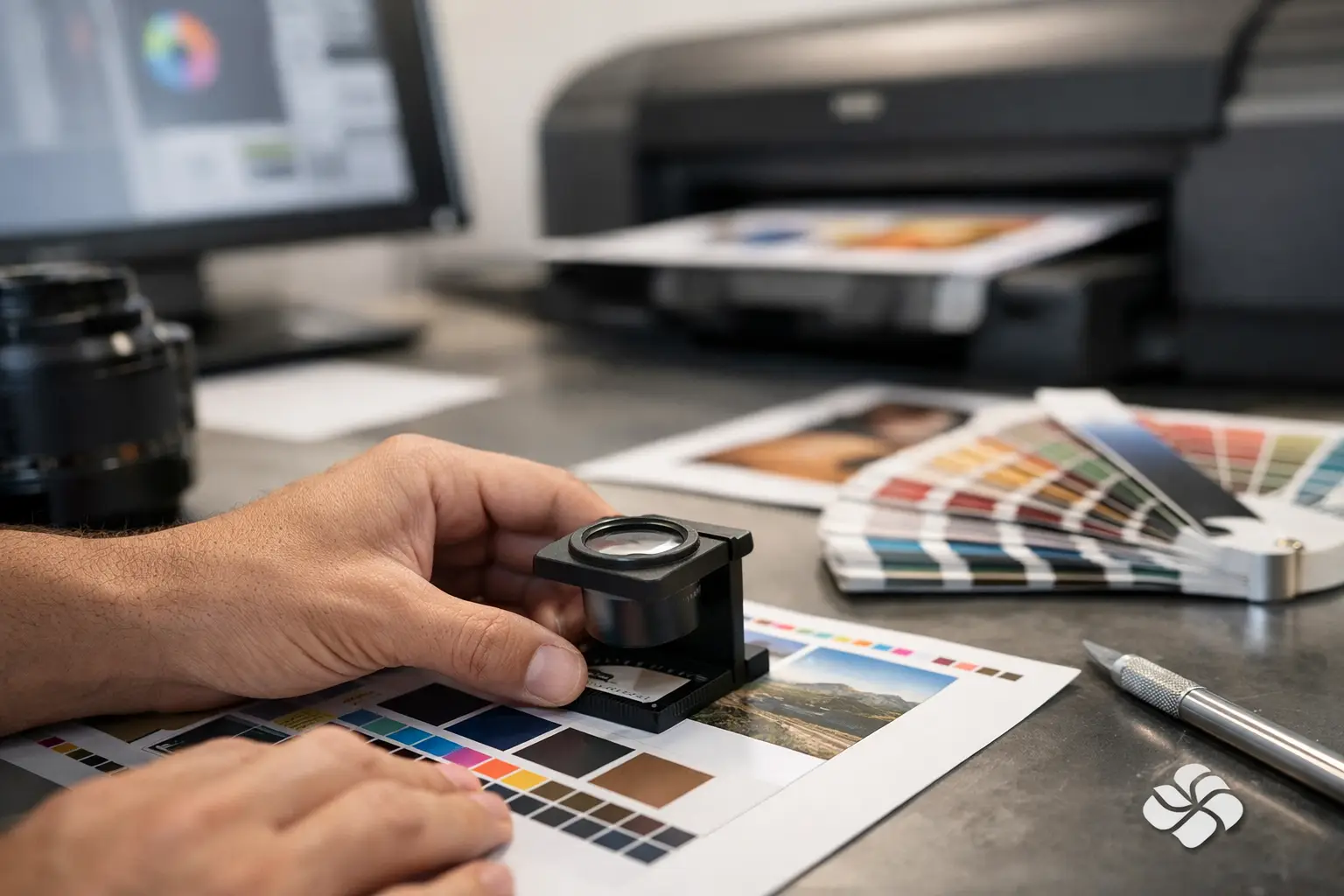
A print ready file is a finished file built to match the final product size, production method, and press requirements. It includes the correct dimensions, proper bleed, enough image resolution, and embedded or outlined fonts. It also uses the right color setup for print rather than screen display.
This matters because commercial printing is exact. A digital proof on your monitor is only part of the picture. Paper stock, trimming, folding, ink coverage, and file construction all affect the final result. A file can look sharp at 100 percent on screen and still fail in production if the setup is off by even a small margin.
How to prepare print ready files from the start
The easiest way to avoid problems is to build the document correctly before you start designing. Retrofitting a file at the end often creates new issues, especially with scaling, image quality, and spacing.
Start with the final trim size
Set your document to the exact finished size of the printed piece. If you are designing a standard business card, flyer, booklet page, or poster, the artboard should reflect the actual trimmed dimensions, not an approximation. Working at the right size keeps text, images, and margins proportional.
Designing at a reduced scale can work for some large-format jobs, but it depends on the application and the printer’s specifications. For everyday business printing, full size is usually the safest choice.
Add bleed before placing artwork
Bleed is the extra image area that extends beyond the trim edge. It gives the printer room to cut the piece cleanly without leaving a thin white line at the edge. In most cases, 0.125 inch on all sides is standard.
If your background color, photo, or graphic touches the edge of the page, it must extend into the bleed area. If it stops at the trim line, even a minor shift in cutting can show an unprinted edge. That is one of the most common print file mistakes.
Keep a safe margin inside the edges
Bleed goes outside the trim line. Safe margin stays inside it. Important content like logos, phone numbers, body copy, and borders should sit at least 0.125 inch inside the trim, and often more for smaller pieces.
This protects your content from looking cramped or getting clipped. It also improves readability. A design can technically fit close to the edge, but good print design usually leaves enough breathing room to feel balanced after trimming.
Use the right color mode for print
One of the biggest differences between screen design and print production is color mode. Screens use RGB light. Printing uses CMYK ink. If you build a file in RGB and send it to press, some colors may shift, especially bright blues, greens, and oranges.
For most commercial print projects, set your file to CMYK before final export. This gives you a more realistic view of how colors will reproduce. Brand colors are worth extra attention. If a business depends on consistent visual identity across letterheads, brochures, presentation folders, and promotional materials, color expectations should be discussed early.
Some projects also use spot colors or specialty inks. That can be the right choice for branded materials where color precision matters, but it depends on budget, quantity, and the print method being used.
Resolution matters more than screen sharpness
An image that looks crisp on a monitor may not hold up in print. For most printed pieces, photos and raster graphics should be 300 DPI at the final printed size. Lower resolution often leads to soft or pixelated output.
This is where scaling can cause trouble. If you place a small web image into a larger print layout and enlarge it, the effective resolution drops. A 300 DPI image can become 150 DPI or worse once it is stretched. The result may still look acceptable for a casual event flyer, but it will not deliver the same professional finish as properly prepared artwork.
Logos are a separate issue. Vector files are ideal because they scale cleanly without losing detail. If your logo only exists as a low-resolution screenshot or copied website image, that should be addressed before printing anything important.
Fonts, transparency, and file compatibility
Missing fonts are a classic source of production delays. If the print provider does not have the exact font used in your design, the text can reflow or substitute unexpectedly. That changes spacing, line breaks, and sometimes the entire layout.
The safest approach is to package the native files properly or export a press-quality PDF with fonts embedded. In some cases, converting text to outlines can help, especially for logos or short headline treatments. The trade-off is that outlined text is no longer editable, so this step should happen only after proofreading is complete.
Transparency effects, shadows, and layered artwork can also behave differently across software versions and RIP systems. A properly exported PDF usually avoids most compatibility problems, but complex files still deserve a quick preflight check before submission.
Common file setup details people miss
A lot of print issues come from small technical details that are easy to overlook when a deadline is tight. Hairline borders placed too close to the edge often appear uneven after trimming. Rich black settings that work well in a headline may be a poor choice for small body text. Overprint settings can cause objects to disappear if they are applied by mistake.
Folds matter too. A tri-fold brochure is not just three identical panels. The inside fold panel is usually slightly narrower so the piece closes properly. Booklets, menus, and presentation folders each have their own setup considerations, and they are worth confirming before production.
If your piece includes variable data, mailing information, numbered forms, or labels, accuracy matters just as much as design. Print ready files are not only about appearance. They also need to function correctly in production.
The best file format to send
In most cases, a high-quality PDF is the preferred file format for commercial printing. It preserves layout, fonts, images, and vector elements more reliably than open native files. Export settings matter, though. A low-quality PDF made for email sharing is not the same as a press-ready PDF.
When exporting, include bleed, use crop marks only if requested, and avoid unnecessary downsampling. If your printer asks for packaged files from Adobe InDesign, Illustrator, or another design program, send everything required, including linked images and fonts where licensing allows.
There is no single rule for every job. A business card order, a wide-format sign, and a multipage booklet can each require different settings. That is why a quick file review before production is often worth more than trying to force every project into the same template.
A practical preflight check before you send anything
Before uploading or emailing your file, take one last look with production in mind. Confirm the document size matches the final piece. Make sure bleed is included where needed. Check that critical text stays inside the safe area. Verify images are high enough resolution and colors are set for print.
Then proofread again. Names, phone numbers, dates, and quantities cause more real-world trouble than software settings. A technically perfect file with the wrong event date is still a bad file.
If possible, view the PDF at 200 percent and then at full page size. The close view helps catch alignment issues and image problems. The full-page view gives a better sense of spacing, hierarchy, and whether the piece feels balanced.
When it pays to ask the printer first
Not every print project should be handled the same way. A rack card, invoice form, booklet, poster, and embroidered logo file all have different production requirements. If you are ordering a recurring business item or preparing a higher-volume run, it makes sense to check specifications before the final design is locked.
That is especially true when paper choice, finishing, folds, variable data, or specialty production are involved. A quick conversation can prevent rework and reduce waste. At Noran Printing, that practical back-and-forth is often what saves customers time. Good print results come from good files, but they also come from clear communication early in the process.
Print ready files do not need to be complicated. They need to be accurate. Get the size right, build in bleed, use print-friendly color and resolution, and check the file like it is headed to press, not just to a screen. That small extra effort is usually what separates a job that simply prints from one that looks polished the moment it comes out of the box.