A poster has a few seconds to do its job. It might be taped in a storefront window, mounted in a school hallway, pinned to a community board, or displayed at an event check-in table. In that short moment, posters need to catch attention, deliver a clear message, and still look professional enough to represent your business or organization well.
That is why poster printing works best when it is treated as more than a quick add-on. Size, paper, color, layout, and placement all affect whether people stop and read or walk right past. For local businesses, schools, nonprofits, and event organizers, a well-produced poster is still one of the most practical ways to promote something quickly and visibly.
Why posters still work
Digital marketing gets most of the attention, but print still holds its ground in the real world. A poster does not depend on an algorithm, a scroll, or a click. It is simply there, in front of the right audience, day after day. For a sale, fundraiser, performance, hiring push, menu feature, or public notice, that consistency matters.
Posters are especially effective when your audience is already in a physical space. A customer standing in your lobby, a parent walking into a school, or a visitor moving through a community event is far more likely to notice a printed message than a social post they may never see. Print also adds credibility. When a poster is designed well and printed cleanly, it signals that the event or business behind it is organized and established.
There is also a cost advantage. Compared with many other forms of advertising, posters offer broad visibility without a large media spend. If you need to promote something locally and quickly, they remain one of the most efficient tools available.
What makes posters effective
The best posters are clear before they are clever. Good design matters, but clarity matters more. If someone cannot understand the message in a few seconds, the poster is doing too much.
Start with one main objective. Are you announcing an event, promoting a limited-time offer, recruiting staff, or directing people to a location? When the purpose is specific, every design choice becomes easier. The headline can be stronger, the supporting details can be tighter, and the visual hierarchy can guide the reader naturally.
A strong poster usually has three jobs. First, it needs to stop the eye. That might come from bold color, a strong image, or a simple headline with enough contrast to stand out from the environment around it. Second, it needs to communicate the main message fast. Third, it needs to tell the viewer what to do next, whether that is attending, calling, scanning, visiting, or remembering.
Too much information is one of the most common mistakes. Businesses often try to fit a flyer’s worth of content onto a poster. The result is crowded, hard to read, and easy to ignore. A poster is not the place for every detail. It is the place for the most important detail.
Choosing the right size and format for posters
Size should match both the message and the location. Small posters can work well on counters, doors, and interior bulletin boards where people are already close enough to read. Larger formats are better for windows, public areas, trade show spaces, and anywhere the audience will see the poster from several feet away.
There is no single best size for every use. A restaurant promoting a seasonal special might need a compact interior display. A school advertising an upcoming registration date may need something larger for common areas. An event sponsor board or street-facing promotion may call for a more prominent format altogether.
Paper choice matters too. Standard stock is often the right fit for short-term indoor use. Heavier stocks can create a more polished look and hold up better during handling. Gloss can make colors pop, while matte can reduce glare under bright lights. For long-term display or higher-traffic environments, durability becomes more important than finish alone.
This is where practical guidance helps. A professional print shop can recommend the right format based on where the poster will be used, how long it needs to last, and what kind of visual impact you want.
Design choices that improve response
A good poster design is built around readability. That starts with headline size and contrast. If the headline cannot be read quickly from the intended distance, the layout needs work.
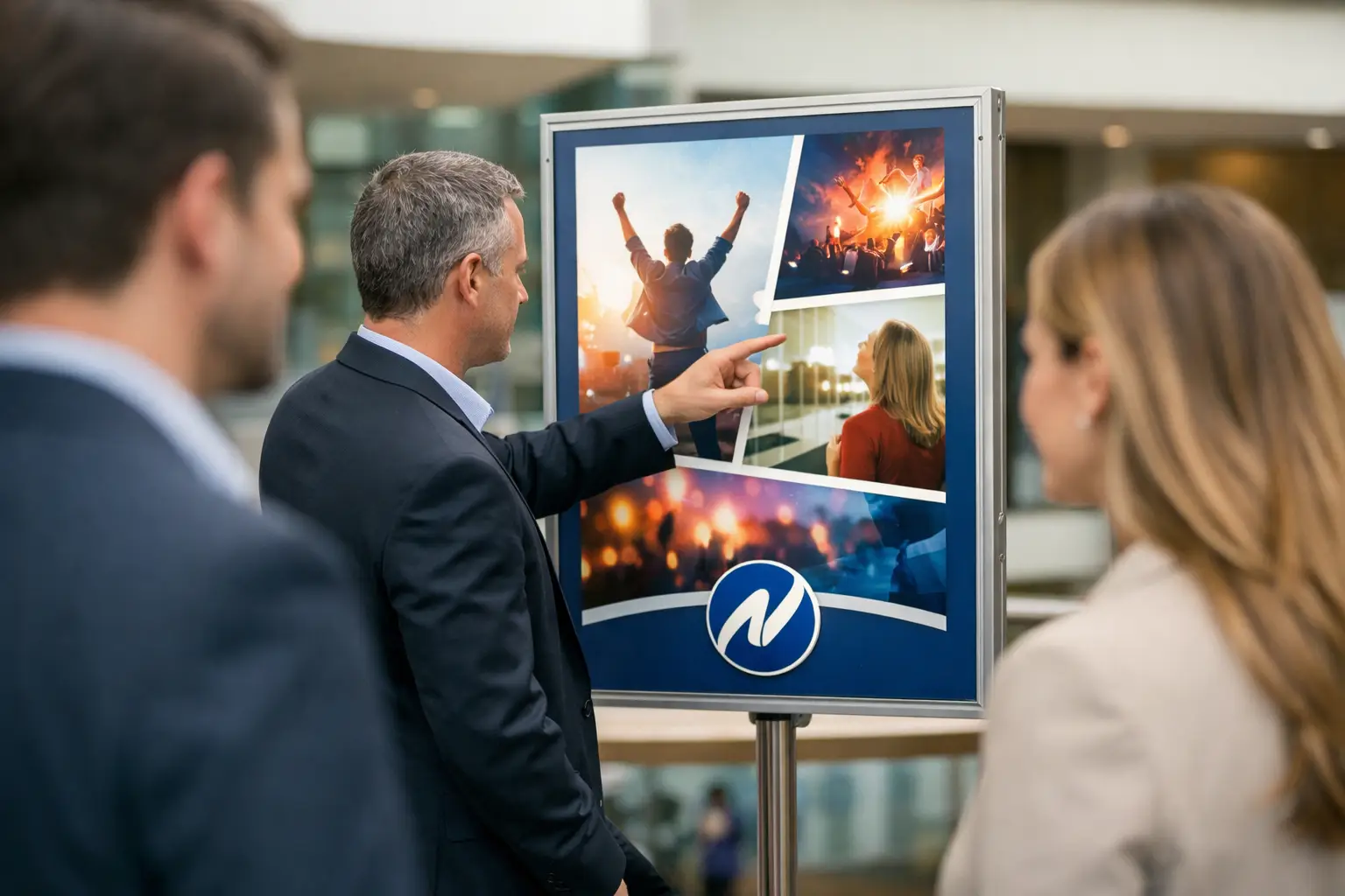
Images should support the message, not compete with it. A strong product photo, event image, or brand graphic can carry a lot of weight, but only if it is high enough quality to print cleanly. Low-resolution artwork may look acceptable on a screen and still fail badly in print.
Typography should be simple and intentional. One or two font families are usually enough. The more styles, sizes, and effects you stack into a poster, the harder it becomes to guide the reader’s attention.
Color should also be used with purpose. Bright color can help attract attention, but that does not mean every poster should be loud. For some brands, a cleaner and more restrained approach creates a stronger impression. It depends on the setting, the audience, and the message. A concert poster and a professional services announcement should not look like they came from the same template.
Print quality matters more than many buyers expect
Posters are often judged from a distance first and up close second. That means print quality has to hold up in both situations. At a glance, the overall color and sharpness need to look strong. Up close, text needs to stay crisp, images need smooth detail, and solid areas of color need consistency.
Poor print quality sends the wrong message fast. Colors that look off-brand, banding in large background areas, pixelated photos, or flimsy paper can make even a good design feel rushed. For businesses and organizations that care about their reputation, those details are not minor.
Reliable production also matters when you are printing multiple posters for several locations. Consistency across the full run is part of professional presentation. If one batch is darker, another is trimmed unevenly, and another curls badly after hanging, the job has not really been done right.
Where posters fit in a broader print strategy
Posters often work best alongside other printed materials. A retail promotion might use window posters to attract attention, flyers to provide more detail, and counter cards to reinforce the message at the point of sale. A school event may use posters in key areas while also relying on programs, tickets, and signage. A business campaign may combine posters with brochures, presentation folders, or direct mail.
That is one reason many organizations prefer working with a full-service print partner instead of splitting projects between vendors. Keeping multiple pieces under one roof helps with brand consistency, scheduling, and quality control. It also saves time for office managers, marketers, and administrators who do not want to coordinate design specs and deadlines across separate suppliers.
For local organizations in Kamloops and surrounding communities, that kind of support can make a real difference, especially when timelines are tight and the materials need to match across several formats.
When to order posters early and when fast turnaround matters
Some poster jobs are planned months ahead. Others come together in a few days. Both are common.
If the poster is tied to a major event, campaign rollout, or seasonal promotion, ordering early gives you more room to review proofs, confirm sizing, and coordinate with other printed pieces. That usually leads to a smoother result.
At the same time, last-minute needs are part of real business operations. A hiring push, a weather-related notice, an event update, or a quick sales promotion may need to move fast. In those cases, working with an experienced local provider matters because speed only helps if the quality still holds up.
Noran Printing works with businesses and organizations that need both dependability and responsiveness. That combination is often what turns a one-time poster order into an ongoing working relationship.
Common poster mistakes to avoid
Most poster problems are preventable. The first is trying to say too much. The second is assuming a digital file will print well without adjustment. The third is choosing a size based only on budget rather than visibility.
Another frequent issue is forgetting the viewing environment. A poster for a bright front window needs different contrast and layout decisions than one for an indoor hallway. Placement should shape design from the beginning, not become an afterthought.
It also helps to think about what happens after the poster gets attention. If people need to act, the next step should be obvious. Date, time, location, phone number, or call to action should be easy to find and easy to read.
Posters are simple in concept, but the details determine whether they blend into the background or actually perform. When the design is clear, the print quality is strong, and the format fits the job, posters continue to be one of the most dependable ways to put your message where people can see it.