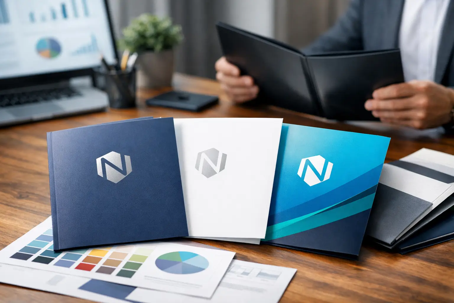
A presentation can be well prepared and still lose impact when the materials are handed over in a thin, generic folder. When you review business folder printing options, look beyond the cover design. The paper, pockets, capacity, and finishing details all affect how confidently your organization presents proposals, sales materials, event packages, and important documents.
A business folder should protect the contents, support your brand, and make information easy to organize. The best choice depends on what goes inside, how often it will be handled, and whether it needs to carry materials beyond a standard stack of letter-size pages.
Start With the Job the Folder Needs to Do
Before choosing a stock or finish, consider the moment the folder will be used. A real estate package, school enrollment kit, contractor bid, medical information package, and corporate sales presentation can all require different solutions.
For a simple leave-behind with a brochure and business card, a standard two-pocket folder is often the practical choice. It keeps the presentation tidy without adding unnecessary cost. For a proposal with multiple inserts, a thicker booklet, sample sheets, or forms, capacity matters more. A folder that looks sharp when empty but bows or tears when filled will not represent your organization well.
Also consider whether the recipient will keep the folder. Materials intended for a short event or one-time meeting may call for a straightforward design and economical production. Materials used for client onboarding, donor packages, executive presentations, or long sales cycles often justify a more substantial stock and refined finishing.
Review Business Folder Printing Options by Format
The classic presentation folder is sized to hold letter-size documents, with two interior pockets and a scored spine. This format is familiar for good reason: it is easy to use, fits most business documents, and provides room for a logo, contact information, and key brand messaging.
A one-pocket folder can be a good fit for rate sheets, menus, event programs, or simple information packages. It offers a clean, less formal look and may reduce cost where a second pocket is not needed. It also keeps the recipient focused on one organized set of materials.
Capacity folders have a wider spine or gusset to hold larger document sets. They are especially useful for construction estimates, legal paperwork, training manuals, reports, or welcome packages. The trade-off is that capacity folders require more planning. The expanded spine changes the dieline, artwork placement, and final cost, so it is worth confirming the expected contents before production begins.
Custom-die-cut folders are appropriate when the package itself needs to stand apart. Unique pocket shapes, tab closures, document slots, and specialty folds can create a memorable presentation. However, custom formats are not automatically better. They can increase setup time, complicate future reorders, and may not suit a fast turnaround. A standard folder with excellent printing and thoughtful design often delivers a stronger return than an elaborate shape used only for novelty.
Consider Business Card Slits Carefully
Business card slits remain useful for many presentations, especially when folders are handed out in person. They make it easy to attach a specific contact person to a proposal or information package. For organizations with several representatives, this can be more flexible than printing individual names on every folder.
That said, card slits are not essential on every project. If your contact information is already prominent on the folder, or if the package is mailed, a slit may add little value. Decide based on how the folder will actually be distributed.
Paper Weight Sets the First Impression
Folder stock has to do more work than a typical flyer. It is folded, handled, opened repeatedly, and asked to support documents in the pockets. A heavier cover stock generally provides the structure businesses expect from a professional presentation folder.
A lighter cover may be suitable for high-volume event handouts or temporary information kits, particularly when budget is the main concern. For client-facing proposals or recurring branded packages, a sturdier stock usually pays off in appearance and durability. It resists bending, feels more substantial in the hand, and helps pockets hold their shape.
Paper texture also matters. Smooth stocks reproduce fine type, gradients, and detailed logos cleanly. Uncoated stocks offer a more natural, writable surface and can work well for professional services, schools, or organizations that need recipients to make notes. Coated stocks often produce richer images and stronger color contrast, making them a natural choice for photography, product imagery, and bold graphic designs.
There is no single best paper. A folder with photography may benefit from a coated sheet, while a folder designed for forms and handwritten notes may work better uncoated. Reviewing a physical sample before final approval can prevent surprises and make the choice more confident.
Choose Printing That Supports Your Brand
Full-color printing gives businesses the greatest flexibility for logos, photography, color blocks, and branded interior panels. It is a strong option when the folder is part of a consistent marketing system or must match brochures, business cards, signage, and promotional materials.
One- or two-color printing can be effective when the design is simple and the brand uses a limited palette. It may also be a practical choice for internal folders, operational packages, or large recurring orders. Simple does not have to look plain. Strong typography, clean spacing, and a well-placed logo can create an organized, credible presentation without heavy graphics.
Think about the inside of the folder as well as the cover. Printing on the interior can highlight services, provide a checklist, include instructions, or reinforce contact details. It is most valuable when it helps the recipient use the contents. Filling every surface with text can make the folder feel busy and distract from the documents inside.
For organizations that personalize packages by recipient, variable data printing may be worth discussing. Names, locations, account details, event dates, or tailored messaging can be incorporated into related printed materials to make a presentation more relevant. This approach is most useful when the package is part of a planned client communication rather than a general handout.
Finishes Add Protection, but They Are Not Always Needed
A finish can change both the appearance and performance of a folder. Gloss coating creates a bright, high-contrast look that suits colorful designs and photo-heavy artwork. Matte finishes offer a softer, more understated appearance and can feel appropriate for professional services, premium brands, and clean modern designs.
Lamination provides added protection against scuffs, moisture, and frequent handling. It is a sensible option for folders used repeatedly, such as sales kits, training resources, or materials carried to meetings and trade shows. It also adds cost, so it may not be necessary for folders intended for one-time distribution.
Spot gloss or metallic details can draw attention to a logo or key design element. Used with restraint, these treatments create a premium effect. Used too broadly, they can conflict with readability or make the folder feel overdesigned. The right finish should support the message, not compete with it.
Build the Design Around Real Contents
One of the most common folder mistakes happens before printing begins: designing the outside first and deciding what belongs inside later. Start by laying out the actual documents, cards, inserts, and brochures the folder will carry. This reveals whether the pockets are deep enough, whether a spine is necessary, and where additional information would be useful.
Keep the front cover focused. A logo, clear identifier, and concise message usually work better than a crowded list of services. Save detailed information for an insert, brochure, or inside panel where readers can take it in at a comfortable pace.
Pay close attention to folds, pockets, and safe areas in the artwork. Critical text should not sit too close to a score line or pocket edge. If the folder uses a dark background, make sure the design accounts for potential scuffing and supports legible type. A professional print partner can check artwork against the folder template and flag production concerns before they become costly reprints.
Order Quantity and Timing Affect the Best Choice
The right quantity is not always the highest quantity. Larger runs can lower the unit cost, but only if the design, contact information, and branding will remain current. If your team changes often or you expect a rebrand, smaller runs may reduce waste and keep materials accurate.
Lead time should be considered early, particularly for custom formats, special stocks, laminating, or folders needed for a major event. Leaving room for proofing and production gives you more choices and better control over the final result. Rushed orders can still be handled in many situations, but standard formats and readily available stocks offer the most flexibility when deadlines are tight.
For Kamloops businesses and regional organizations that need folders alongside brochures, forms, apparel, signage, or promotional items, coordinating those materials with one local print partner can simplify brand consistency and delivery planning. Noran Printing can help match folder choices to the practical demands of the full package.
A business folder is a working piece of your brand, not just a cover for paperwork. Bring a sample of what you plan to place inside, explain how the folder will be used, and choose the options that make the package feel organized, durable, and ready to represent your organization well.