A business card gets judged fast. Before anyone reads your name, they notice the weight, the finish, the sharpness of the print, and whether it feels like something worth keeping. That is why understanding business card printing options matters. The right choice can make a small card feel polished and credible, while the wrong one can make a good brand look rushed.
For most businesses, there is no single best card. A realtor, accountant, contractor, restaurant owner, and school administrator do not need the same stock, coating, or quantity. The best result comes from matching the card to how it will be used, who will receive it, and what impression it should leave.
How to compare business card printing options
When people ask about business card printing options, they are usually asking four things at once: what paper to choose, what finish looks best, how thick the card should feel, and how many to order. Those decisions work together. A premium paper with a basic design can look excellent. A busy design on the wrong stock can feel less professional, even if the artwork itself is strong.
Start with use. If your staff hands out cards every day at meetings, job sites, and networking events, durability matters. If you use cards for occasional introductions or appointment reminders, cost and simplicity may matter more. If the card needs space for notes, a glossy finish may work against you. If image quality is the priority, coating can help colors look cleaner and richer.
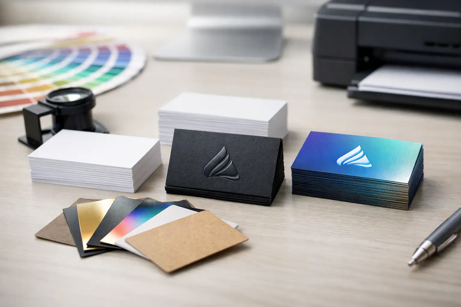
Paper stock and thickness
Stock is the foundation of the card. Standard business card stock works well for many companies because it is practical, affordable, and still professional when printed properly. It gives you a clean presentation without pushing the budget too far, which is important for teams that reorder often.
Heavier stock creates a more substantial feel. People notice that weight immediately. It can be a smart choice for businesses where trust, quality, and presentation are part of the sale, such as financial services, real estate, legal offices, and premium home services. Thicker does not automatically mean better, though. If the card is too heavy for your holders, wallets, or everyday use, it becomes less convenient.
There is also a branding question here. A solid, uncoated stock can feel understated and confident. A very thick glossy card can feel more promotional. Neither is wrong, but they send different signals. The best choice depends on how you want your company to come across.
Coated, uncoated, and matte finishes
Finish changes both appearance and function. Gloss coating tends to make colors pop. Photos, logos, and bold graphics often look more vibrant on a gloss-coated card. That makes gloss a common choice for brands that want visual impact.
The trade-off is practicality. Gloss can show fingerprints more easily, and it is harder to write on. If your team writes appointment times, direct cell numbers, or quick notes on cards, gloss may create frustration.
Uncoated cards have a more natural paper feel. They are easier to write on and often suit professional services, local trades, and organizations that want a straightforward, dependable look. Uncoated stock can also soften the design slightly, which works well for simple layouts and text-heavy cards.
Matte coating sits between the two. It gives the card a smooth, refined finish without the shine of gloss. Matte is often a strong option for modern branding because it feels polished but restrained. It also reduces glare, which helps readability. For many businesses, matte offers a good balance of appearance and usability.
Standard cards versus premium finishes
Most business cards do not need special effects to work well. Clean layout, readable type, and quality printing carry most of the value. Still, premium finishing can add something meaningful when used with restraint.
Soft-touch finishes create a velvety feel that people remember. Spot gloss can highlight a logo or design element. Raised print or foil can add texture and contrast. Rounded corners can make a card stand out without changing the entire design.
These upgrades are best when they support the brand rather than compete with it. A premium law office may benefit from a subtle textured finish. A creative business may use spot gloss to emphasize visual identity. A local contractor may be better served by a durable matte card with bold contact information and no extra embellishment at all. Premium options cost more, so the question is not whether they look impressive. It is whether they improve the result enough to justify the added expense.
Full color, black and white, and design coverage
Color choice is partly visual and partly financial. Full-color cards are common because they allow logos, brand colors, and images to reproduce accurately. For businesses with established branding, color consistency matters. A card should look like the rest of your printed materials, from brochures to presentation folders.
Black-and-white cards can still look excellent. In some cases, they feel more classic and direct. This can work especially well with strong typography, minimal design, and uncoated stock. If your brand is built around simplicity and professionalism, black and white may be a deliberate choice rather than a budget compromise.
Single-sided and double-sided printing also deserve attention. A single-sided card keeps things simple and may lower cost, but it limits space. Double-sided cards give room for additional details, service lists, appointment information, or a cleaner layout overall. If the front feels crowded, using the back is usually the better decision.
Quantity and reordering strategy
Ordering quantity is where many businesses either overspend or underplan. Large quantities often reduce unit cost, which sounds efficient. But if phone numbers, staff names, services, or branding change frequently, buying too many cards can create waste.
Small to mid-sized businesses usually do best when they match quantity to real usage. A solo professional with stable contact details may benefit from ordering more at once. A growing company with several staff members may prefer shorter runs and easier updates. If employee turnover or title changes are common, flexibility matters.
This is also where working with a dependable local print provider helps. Instead of guessing how many to order for the next year, you can make a practical decision based on actual demand, turnaround expectations, and the likelihood of changes.
Choosing business card printing options for your industry
Different industries tend to benefit from different approaches. Service businesses often need durability, clarity, and easy readability. Their cards may be handed out on job sites, in vehicles, or during quick in-person introductions, so a sturdy matte or uncoated card usually makes sense.
Professional offices often lean toward heavier stock and restrained design. Their cards need to communicate credibility and order. Schools, nonprofits, and community organizations may prioritize affordability and easy reordering, especially when multiple staff members need cards with variable information.
Retail and hospitality businesses sometimes use cards more creatively, as loyalty reminders, appointment cards, or promotional handouts. In those cases, writable surfaces and double-sided layouts can be more useful than premium finishes. The best card is not always the most expensive one. It is the one that fits how your business actually operates.
Why print quality still matters
Business cards are small, which makes flaws easier to notice. Fuzzy text, poor alignment, off-brand color, and flimsy stock all stand out quickly. That is why print quality matters as much as design. A well-produced simple card usually performs better than an overly ambitious card printed poorly.
For businesses that care about consistency across letterheads, envelopes, brochures, forms, and promotional materials, business cards should not be treated as a throwaway item. They are often the first printed piece someone sees. If it feels inconsistent, that impression can carry over to the rest of your brand.
A full-service local shop like Noran Printing can help businesses sort through these choices without overcomplicating the process. That matters when you are managing recurring print needs and want one reliable source for quality, service, and practical turnaround.
Making the right choice without overthinking it
The smartest approach is usually simple. Choose a stock that feels appropriate for your brand, a finish that supports how the card will be used, and a quantity that reflects how often your information changes. Keep the layout clean. Make the contact details easy to find. Let quality do the heavy lifting.
If you are unsure where to start, matte or uncoated stock with a clear double-sided layout is often a safe place to begin. From there, you can adjust based on budget, audience, and how formal or premium you want the card to feel.
A business card does not need to be flashy to be effective. It just needs to feel intentional, well made, and true to the business behind it. When the card matches the quality of your service, people notice that too.