
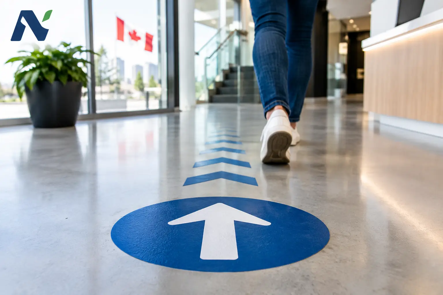
A customer walks through your door already making decisions. Where do they go first? What promotion do they notice? Is there a lineup, a pickup counter, or an event registration table to find? Floor graphics put useful answers directly in the path of traffic, without taking up a wall, window, or counter.
For businesses, schools, venues, and community organizations, this is more than a novelty print product. A well-planned floor graphic can direct movement, reinforce a campaign, improve wayfinding, or make an ordinary entrance feel more intentional. The key is choosing the right message, material, and placement for the people who will walk over it every day.
What Floor Graphics Can Do for Your Business
Floor space is often overlooked because it is functional first. Yet it is one of the few surfaces customers naturally see while moving through a location. A graphic near an entrance can introduce a seasonal offer. Decals leading to a service desk can reduce confusion. Branded markers at a trade show booth can help define your space when surrounding displays compete for attention.
They are especially useful when the message needs to be immediate. A restaurant may use them to guide guests toward ordering and pickup areas. A retail store may highlight a new product display or an aisle promotion. A school or community center may use clear, friendly markers to direct visitors during a tournament, open house, or fundraiser.
The strongest applications combine a practical purpose with a branded one. An arrow alone gets people moving, but an arrow using your colors, logo, and message also makes the experience feel organized and consistent. That balance matters. If every available surface is asking for attention, customers stop noticing. Floor graphics work best when they offer a clear next step.
Planning Floor Graphics Before Production
A floor decal should be planned around the space where it will be used, not just the artwork on screen. Before deciding on a size or shape, consider foot traffic, flooring type, lighting, cleaning routines, and how long the message needs to remain in place.
Start with one clear action
A customer should understand the graphic in a moment. Messages such as Follow the Arrows, Order Here, Scan to Enter, or New Arrivals Ahead are easy to act on. Long sentences, small details, and multiple competing calls to action are harder to read from a standing position.
Distance changes how artwork is viewed. Fine print that looks sharp on a proof may be unreadable on the floor. Use large type, high contrast, and simple visual hierarchy. If a QR code is part of the design, it needs enough clear space around it and must be large enough to scan comfortably from a phone held above the floor.
Choose placement with traffic in mind
The most visible location is not always the best location. Avoid spots where doors swing open, where carts repeatedly turn, or where people must abruptly stop to read. A directional message belongs before the decision point, not after it. For example, a decal directing guests to a pickup counter should appear early enough for them to change course naturally.
It also helps to think about the customer journey from beginning to end. Entrance graphics can welcome or orient visitors. Mid-store graphics can promote a department or lead guests toward a feature display. Graphics near checkout can reinforce a promotion, loyalty program, or upcoming event. Each placement has a different job.
Match the campaign timeline
Some floor graphics are intended for a weekend event. Others support a seasonal promotion or remain in place for months. The expected duration affects the choice of adhesive, laminate, and installation approach. A short-term decal may prioritize easy removal, while a longer-term application needs stronger durability and a surface prepared for reliable adhesion.
Materials Matter More Than They Seem
Floor graphics are not simply posters placed underfoot. They need materials designed for pedestrian traffic, including a protective surface that provides appropriate slip resistance. The right product depends on the flooring and the conditions it faces.
Smooth indoor surfaces such as sealed concrete, tile, vinyl, and laminate are common candidates, but each should be assessed before installation. Texture, waxes, coatings, moisture, and cleaning chemicals can all affect how well a graphic adheres and how long it holds up. Carpet applications require a product made specifically for carpet, while rough exterior surfaces call for a different approach than smooth indoor flooring.
Durability is a trade-off, not a one-size-fits-all promise. A graphic at the entrance of a busy store will experience more dirt, moisture, and abrasion than one inside an office hallway. Outdoor use adds weather, temperature changes, and surface irregularities. In high-traffic areas, investing in the proper substrate and protective finish is usually more cost-effective than replacing an unsuitable decal early.
Color is another practical consideration. Brand colors should be accurate, but a white background near an entrance may show scuffs faster than a darker, more forgiving design. A local print partner can help balance the visual goal with the realities of the setting, including color consistency across floor decals, window graphics, posters, and other campaign pieces.
Designing Graphics People Can Read While Moving
A floor graphic has only a few seconds to work. People are walking, carrying bags, talking to others, or looking for where they need to go. That calls for clean design rather than crowded design.
High contrast is usually more valuable than decorative detail. Strong color differences between the background and text improve readability, especially in uneven lighting. A simple directional arrow, bold headline, and recognizable brand element often outperform an elaborate layout filled with copy.
Shape can add function. Circles work well for stand-here markers or short messages. Long strips naturally suit directional paths. Custom contours can create impact for a product launch or event, but they should still be easy to understand from above. The visual should support the message, not make people work to decode it.
Consistency matters when graphics are part of a larger campaign. The same colors, type treatments, and logo usage should carry through to posters, table tents, banners, brochures, labels, and digital signage. This is where working with one print provider can save time and reduce variation between pieces. Noran Printing helps local organizations coordinate print materials so a campaign looks intentional from the first sign to the final handout.
Installation and Care Protect Your Investment
Even a well-produced graphic can fail if it is applied to a dusty, damp, or poorly prepared surface. Floors should be thoroughly cleaned and allowed to dry before installation. Any waxes, residues, or surface treatments should be considered, since they may interfere with adhesion.
Installation should be careful and deliberate. The graphic needs to lie flat, with edges firmly secured and no trapped air that could create lifting over time. It is wise to inspect the decal regularly, particularly in heavily traveled areas. If edges begin to lift or the surface becomes damaged, address it promptly rather than waiting for it to become a safety concern.
Cleaning practices should follow the material guidance. Aggressive chemicals, abrasive pads, and high-pressure cleaning methods can shorten the life of some graphics. For temporary event decals, removal should be planned as carefully as installation so the floor is left clean and presentable.
Make the Floor Part of the Experience
The best floor graphics do not compete for attention just because they can. They make a location easier to navigate, a promotion easier to notice, or an event easier to enjoy. When the message is useful, the design is clear, and the material fits the environment, the floor becomes one more dependable place for your brand to do its job.