A letterhead still does a lot of quiet work. It appears on quotes, invoices, official correspondence, contracts, donation requests, school notices, and internal documents that need to feel credible the moment they land on a desk. If you are figuring out how to design letterheads, the goal is not to make the page look busy. The goal is to make every document look established, consistent, and easy to trust.
That balance matters more than many businesses expect. A letterhead has to carry your brand, but it also has to leave enough room for the message itself. Good design supports communication. Poor design competes with it.
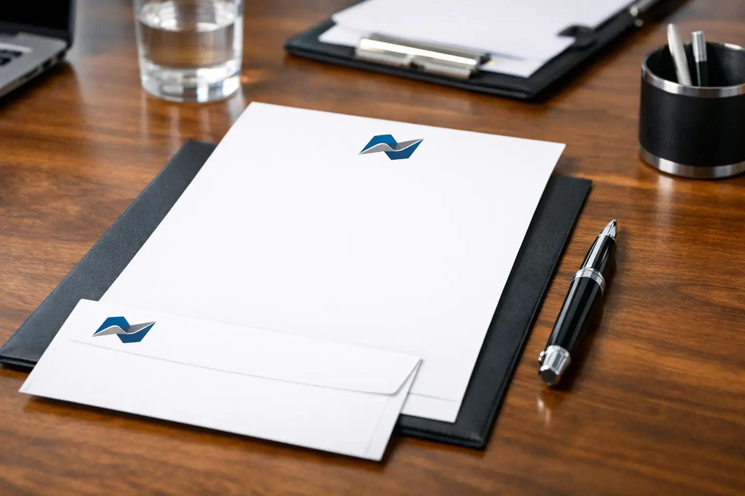
How to design letterheads with the right purpose first
Before you choose fonts or move a logo into the corner, decide what the letterhead needs to do in daily use. A law office, contractor, school, nonprofit, and medical clinic may all need letterheads, but the design priorities are not identical. Some need a more formal tone. Others need room for approval signatures, account details, or reference numbers.
Start by thinking about where the sheet will be used. If it is mainly for formal correspondence, a restrained layout usually works best. If it will appear on estimates, cover letters, and sales documents, the design may need stronger brand presence. If it will run through office printers after it is preprinted, ink coverage and margin placement become practical concerns, not just visual ones.
This is where many businesses make a common mistake. They treat letterhead like a mini poster. In print, that rarely helps. A good letterhead should look polished when the page is full of text and still look intentional when the page carries only a short note.
The core elements every letterhead should include
Most letterheads need the same foundation: company name, logo, and contact information. Depending on the business, you may also want a physical address, phone number, email address, website, tagline, licensing details, or a short identifier such as department name.
The question is not whether to include these items. The question is how much information belongs on the page. If you crowd the top and bottom margins with every possible detail, the sheet starts to feel cramped. If you strip out too much, the page can feel generic.
In most cases, your business name and logo should lead, while the supporting contact details stay secondary. That visual hierarchy helps the page feel professional. It also ensures that when someone glances at the document, they recognize the sender immediately.
A footer can work well for contact information because it keeps the top of the page cleaner. But that depends on the type of documents you send. If your footer will compete with signatures, legal notes, or page numbers, keeping key contact details near the top may be the better choice.
Layout matters more than decoration
When businesses ask how to design letterheads, they often focus on graphics first. In practice, spacing does more of the heavy lifting. Margins, alignment, and proportion determine whether the page feels organized.
A strong letterhead layout usually gives the logo a defined position, establishes a clear text area, and creates enough white space so the document does not feel boxed in. White space is not empty space. It is what makes the page readable.
Top-heavy designs are common, and they can work, but only if the header does not push body text too far down the page. A left-aligned logo with supporting details on the right is a dependable option because it feels structured without being stiff. Centered layouts can look more formal, though they require careful spacing to avoid a dated appearance.
A subtle bottom band, a fine rule line, or a lightly tinted brand element can help anchor the page. The key word is subtle. Heavy blocks of color may look sharp on screen but can reduce writing space and increase print cost, especially on larger runs.
Choose fonts and colors that print well
Letterhead design is not just about what looks good in a digital mockup. It has to reproduce cleanly on paper. That means readability comes first.
Use one or two fonts at most. Your primary brand font can work for the company name or headings, while a clean, highly legible font handles contact information. Tiny type may seem elegant on screen, but on paper it becomes harder to read, especially for addresses, phone numbers, and email details.
Color choices need the same discipline. Brand colors should be present, but they should not overpower the content. Deep blues, restrained grays, and other stable corporate colors tend to perform well because they support the brand without taking over the page. Lighter tints can add sophistication, but they need enough contrast to remain visible in print.
There is also a practical trade-off here. Full-color letterheads can look impressive, but they are not always necessary for every business or every print run. A one-color or two-color design can still look established if the layout is strong. If the letterhead will be used in high volume, simplifying the palette may improve efficiency without sacrificing professionalism.
Paper stock changes how the design feels
A letterhead is both a design piece and a physical object. Paper selection affects the impression almost as much as the artwork does.
Standard uncoated stocks are a reliable choice because they feel professional, accept writing well, and perform properly in office printers. That matters if staff will be adding variable information later. A smooth stock can create a cleaner, more refined look, while a more textured option may suit formal or traditional brands.
Heavier paper can feel premium, but there is a point where thicker is not better. If the sheet needs to run through copiers, laser printers, or folding equipment, going too heavy may create problems. For many businesses, a quality text-weight stock offers the best balance of presentation and day-to-day usability.
This is one area where working with an experienced print shop can save time. A design that looks right on one sheet may not feel right on another. Paper brightness, opacity, and finish all influence how ink appears and how the finished piece represents your brand.
How to design letterheads for print, not just for screen
The file setup matters. A sharp design can still produce poor results if it is built incorrectly.
Use high-resolution logo files and set the document at the correct page size from the beginning. Keep important content away from trim edges and maintain a safe margin for body text. If design elements bleed off the page, the file needs proper bleed settings. Without them, printed edges may appear uneven.
Color should also be prepared with print in mind. Files built in RGB may shift when converted for production. If your brand depends on accurate color, especially in logos, that conversion should be handled carefully.
Another detail many businesses overlook is overprinting after the letterhead is printed. If your team plans to add letters, invoices, or notices using an office machine, the preprinted design must leave enough clean space and avoid placements that interfere with the printer’s non-printable margins.
Keep branding consistent across business stationery
Letterhead rarely stands alone. It usually works alongside envelopes, business cards, invoices, forms, and presentation folders. That is why a good design should feel like part of a system, not an isolated piece.
Consistency does not mean every item needs the exact same layout. It means the visual language should match. Your logo treatment, typography, color use, and overall tone should carry across the set. When these pieces align, the business looks more established and more trustworthy.
For organizations that send out a range of printed materials, this consistency saves time as well. Once the design standards are set, reordering and expanding into other items becomes much simpler. That is one reason businesses in Kamloops often prefer working with one print partner that can manage the full set rather than piecing it together from multiple vendors.
Common mistakes that make letterheads look dated
The fastest way to weaken a letterhead is to overdesign it. Too many graphic elements, multiple fonts, oversized logos, and heavy borders can make the page feel old-fashioned. So can contact blocks packed with unnecessary details.
Another issue is poor balance. If the branding is too faint, the page loses identity. If the branding is too strong, the content feels secondary. The right answer depends on how formal the document is and how often the sheet will be reused.
Some businesses also forget to test the design in real conditions. A letterhead should be reviewed with a full paragraph of text on the page, not just as a blank sample. It should also be checked when printed on the actual stock, because paper and ink can change the look more than expected.
A well-designed letterhead should not call attention to itself for the wrong reasons. It should simply make the document look like it came from a business that pays attention.
If you are updating your stationery, think beyond the logo placement and ask how the piece will perform in daily use. The best letterheads look professional because they are built for real business communication, printed properly, and designed with enough restraint to last.