A presentation folder gets judged before anyone reads what is inside it. If the cover feels flimsy, the pockets split, or the logo prints muddy, the whole package looks rushed. That is why knowing how to print presentation folders the right way matters for proposals, sales kits, school packets, event handouts, and welcome materials.
For most businesses, the challenge is not whether to use folders. It is choosing the right specs so the folder looks professional, holds up in use, and fits the documents going inside. A good folder does all three. A poor one may save a little up front, but it often costs more in wasted prints, reorders, or a weaker first impression.
How to print presentation folders with the end use in mind
The first decision is not paper stock or finish. It is purpose. A folder for a real estate package, a board meeting, and a school enrollment packet may all look similar at a glance, but they need different things.
If your folder will carry a few lightweight sheets, a standard pocket folder may be enough. If it will hold brochures, contracts, inserts, or a business card, you need to think about pocket depth, expansion, and whether a slit for a card makes sense. If the folder is meant for repeated handling, durability matters more than keeping costs at the absolute minimum.
This is where many orders go sideways. People choose based on appearance alone, then realize the contents slide around or the pockets are too tight. Before you print, decide what will go inside, how many pieces it needs to hold, and whether it will be handed out once or used over time.
Pick the right folder style
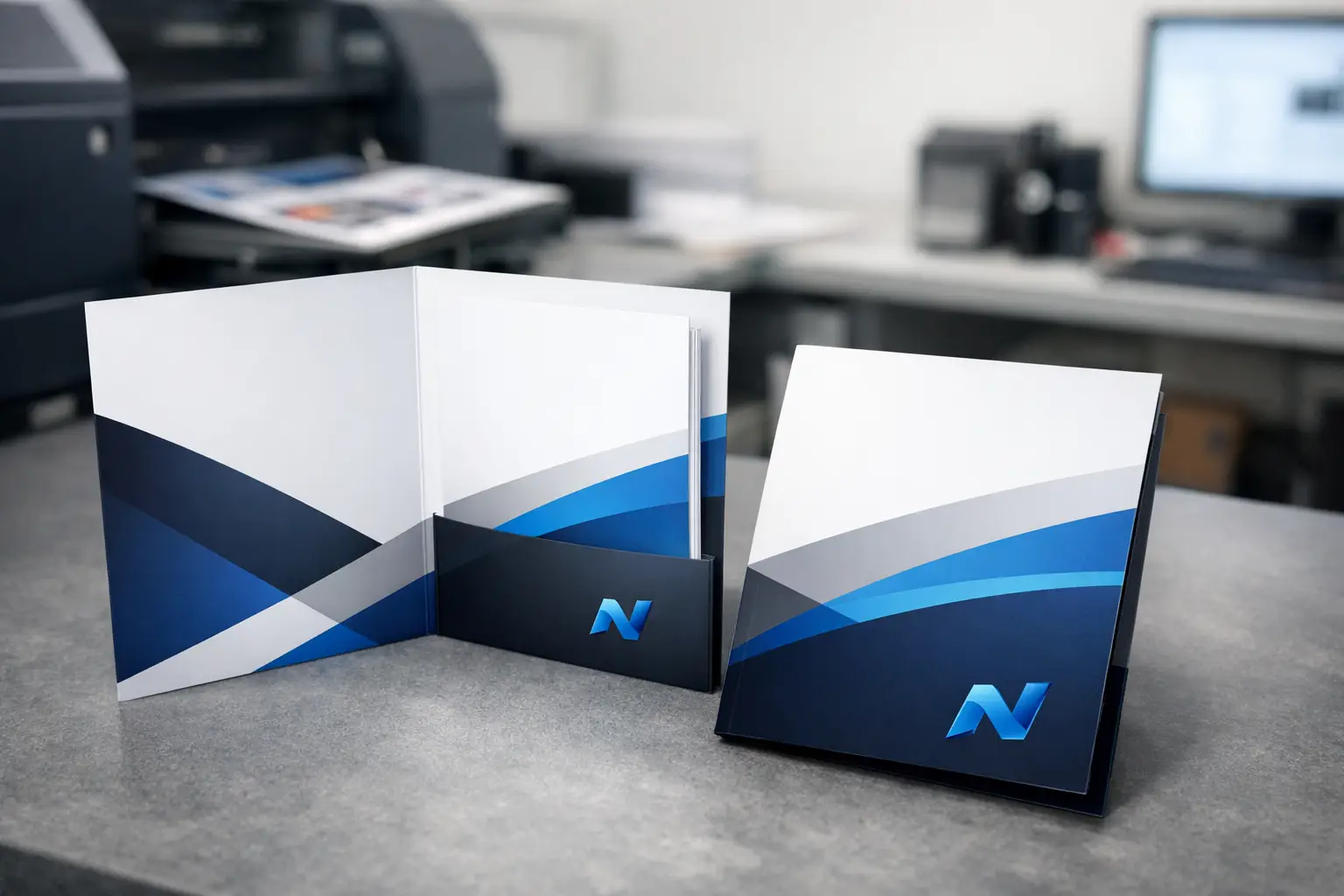
Most presentation folders start with a simple choice between one pocket or two pocket construction. Two pocket folders are the standard for proposals, onboarding packets, and sales materials because they organize content cleanly. One pocket options can work well for lightweight leave-behinds or event materials where simplicity matters.
Capacity is another factor. A standard folder works well for a modest number of sheets. If you are packing in thicker inserts or multiple pieces, an expandable design may be worth it. Expansion adds cost, so it only makes sense when the folder truly needs the extra room.
Business card slits are still useful, especially for service businesses, sales teams, financial professionals, and organizations that rely on face-to-face contact. But if you are not including cards, skip them. Extra features should serve a real purpose, not just fill space on a spec sheet.
Common uses that affect the design
Proposal folders often benefit from a polished finish and strong stock because they are part of a sales presentation. Event folders may need a larger quantity at a practical price point. Internal company folders can sometimes use a simpler layout if they are more functional than promotional.
The best folder is the one built for the job. That sounds obvious, but it is the difference between a folder that supports your brand and one that simply exists.
Choose paper stock that feels professional
When people ask how to print presentation folders, they often mean design. In print, the stock matters just as much. A folder is handled, opened, filled, and carried. It needs stiffness.
A heavier cover stock is the usual choice because it gives the folder structure and helps it resist bending. Thinner stock may lower the unit price, but it can feel cheap fast, especially if the folder is carrying multiple sheets. On the other hand, going too heavy can affect folding and increase production costs. There is always a balance.
For many business uses, a coated cover stock gives a sharper printed result and stronger color. An uncoated stock can feel more understated and may suit professional or institutional applications where a softer, writable surface is useful. Neither is universally better. It depends on the brand and how the folder will be used.
If you want a clean corporate look with strong logo reproduction, coated stock is often the better fit. If you want a more natural, tactile feel or expect people to write on the folder, uncoated can be the smarter choice.
Get the finish right
Finishing changes how a folder looks and how it wears over time. Gloss can make images and colors stand out, while matte tends to feel more refined and reduces glare. A soft-touch laminate can create a premium feel, but it is not necessary for every project.
The trade-off is simple. Higher-end finishes improve appearance and durability, but they increase cost. If the folder is part of a proposal for a high-value client, that upgrade may be worthwhile. If you need hundreds for a one-day event, a standard finish may be the better business decision.
Finishes also affect practicality. A glossy surface may show fingerprints more easily. A matte surface may look cleaner in frequent handling. If your folder includes dark solid colors, talk through finish choices carefully, because scuffing can show more on some combinations than others.
Design for print, not just for screen
A folder design has to work on a die line, not only on a flat digital artboard. That means the front cover, back cover, pockets, folds, and bleeds all need to be planned accurately. If artwork crosses folds or pocket areas, placement has to be precise.
Logos and important text should stay clear of score lines and trim edges. Background colors or images that bleed off the page must extend beyond the cut line so you do not end up with unwanted white edges. Small shifts can happen in production, so build the file with real-world tolerances in mind.
This is especially important with presentation folders because they are assembled after printing. The finished piece is not just trimmed. It is folded, glued, and handled. A design that looks balanced on screen can look off once the folder is formed if the layout did not account for that structure.
File setup mistakes to avoid
Low-resolution logos, RGB files, missing bleeds, and text placed too close to edges are common problems. So is forgetting about the pocket area and placing key content where it becomes hidden once the folder is assembled.
If you are using brand colors, ask about the best way to reproduce them consistently. Some jobs are fine in standard process printing. Others benefit from more controlled color handling depending on your brand standards and quantity.
Think through quantity and timing
Presentation folders are often tied to a deadline. A pitch meeting, conference, enrollment period, fundraiser, or board presentation does not move because the folders are late. That is why quantity and turnaround should be decided early, not at the last minute.
Short runs can be practical for smaller organizations, seasonal campaigns, or test orders. Larger runs may improve unit cost if you know you will use the folders over time. The risk with buying too many is obsolescence. If your branding, contact details, or messaging might change soon, ordering a huge quantity is not always the bargain it seems.
Timing depends on more than press time. Approval cycles, file corrections, finishing, and assembly all matter. Custom folders are not the kind of piece you want to rush without checking details.
Work with a printer that asks the right questions
If you are figuring out how to print presentation folders for your business, a good print partner should help you narrow the decisions instead of making the process harder. That means asking what the folder needs to hold, how it will be used, what image you want it to project, and where the budget needs to land.
This matters even more for organizations ordering multiple items at once. If your folders are part of a larger package that includes brochures, inserts, forms, or promotional materials, coordination becomes part of the value. Consistency across the full set is what makes the package feel organized and professional.
A local shop with broad production capability can also help catch issues before they become expensive. In markets like Kamloops, many businesses and community organizations prefer that kind of hands-on support because it saves time and leads to fewer surprises.
What a strong presentation folder should accomplish
A good folder should feel solid in hand, print cleanly, hold its contents without strain, and match the rest of your brand materials. It should make your documents easier to present, not harder to manage. Most of all, it should support the message you are already trying to deliver.
That is the real answer to how to print presentation folders well. Start with use, choose the right structure and stock, build the file properly, and do not treat the folder as an afterthought. When the details are right, the folder does its job quietly and effectively – which is exactly what professional print should do.
If you are ordering folders for an upcoming project, give yourself enough room to make smart choices. The best print results usually come from a clear plan, not a rushed correction.